More tattoo flash

Another traditional piece of tattoo flash for my site at tattoosbybrian.com
posted by Brian Massey at 7:57 AM
0 comments
![]()
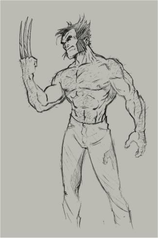
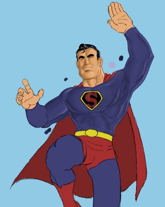
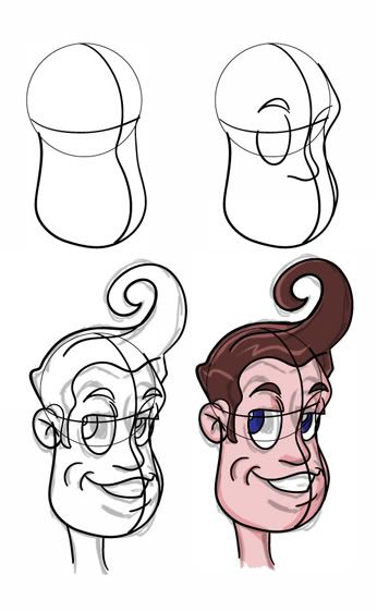
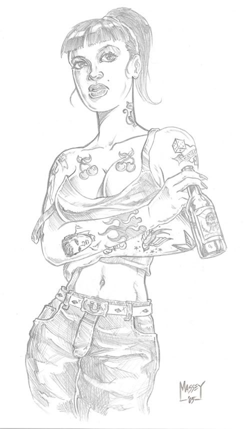
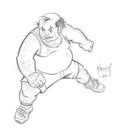
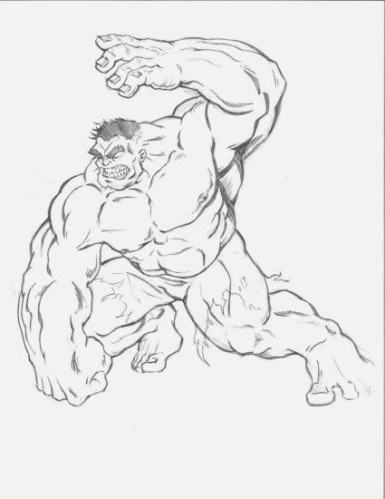
Sketches, finished pieces, and whatever else I decide to throw on here... Enjoy!
posted by Brian Massey at 7:57 AM
0 comments
![]()

posted by Brian Massey at 8:09 AM
0 comments
![]()

posted by Brian Massey at 11:28 AM
0 comments
![]()

posted by Brian Massey at 1:15 PM
0 comments
![]()

posted by Brian Massey at 7:49 AM
1 comments
![]()

posted by Brian Massey at 6:24 PM
0 comments
![]()

posted by Brian Massey at 10:38 PM
0 comments
![]()
posted by Brian Massey at 8:47 AM
0 comments
![]()
posted by Brian Massey at 7:56 PM
0 comments
![]()

posted by Brian Massey at 11:43 AM
0 comments
![]()
posted by Brian Massey at 8:56 AM
0 comments
![]()
posted by Brian Massey at 8:51 AM
0 comments
![]()
posted by Brian Massey at 9:12 AM
0 comments
![]()
posted by Brian Massey at 11:36 AM
0 comments
![]()
posted by Brian Massey at 8:27 AM
0 comments
![]()

posted by Brian Massey at 12:40 PM
0 comments
![]()
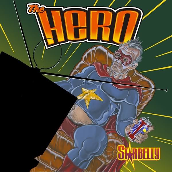
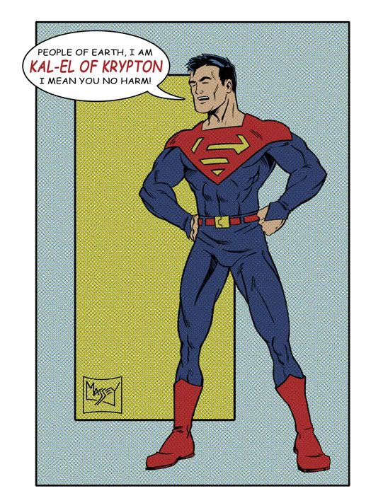
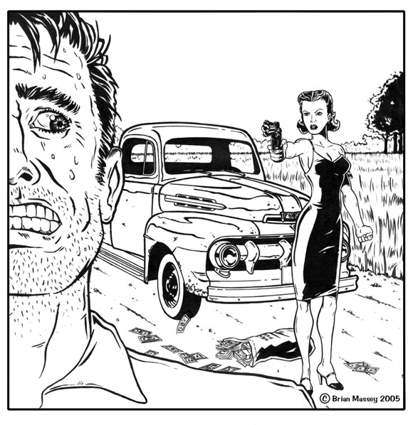
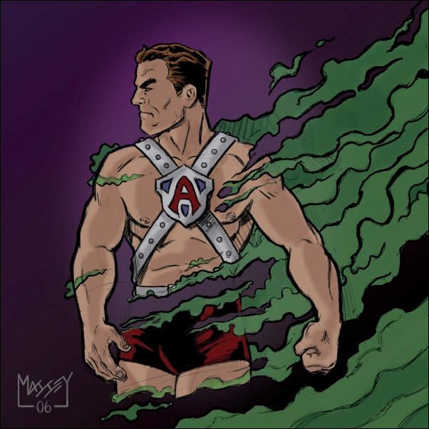
I was looking for something else on an archive disc and found this pic I drew a couple of years ago... there are some things I'd do different now but all in all it made me giggle... so I figured I'd share. It was done for a band called Starbelly and while the aged superhero has been done to death now at the time it wasn't so cliché... plus it was the theme of like four of the songs on the album so it's what they wanted. Hand painted with acrylic on illustration board...
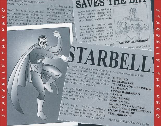
The second one is the tray card for the back... I wanted it to look like the clippings he saved from his glory days and incorporate some band stuff...
posted by Brian Massey at 8:27 AM
3 comments
![]()
posted by Brian Massey at 1:22 AM
0 comments
![]()


posted by Brian Massey at 10:29 PM
2 comments
![]()

posted by Brian Massey at 5:41 PM
0 comments
![]()
posted by Brian Massey at 2:45 PM
0 comments
![]()
posted by Brian Massey at 2:29 PM
0 comments
![]()
posted by Brian Massey at 2:22 PM
0 comments
![]()
posted by Brian Massey at 2:19 PM
0 comments
![]()
posted by Brian Massey at 2:11 PM
2 comments
![]()
posted by Brian Massey at 9:53 AM
0 comments
![]()
posted by Brian Massey at 11:27 AM
0 comments
![]()
posted by Brian Massey at 6:56 AM
0 comments
![]()
posted by Brian Massey at 5:24 PM
0 comments
![]()
posted by Brian Massey at 5:11 PM
2 comments
![]()
posted by Brian Massey at 4:58 PM
0 comments
![]()
posted by Brian Massey at 4:35 PM
0 comments
![]()
posted by Brian Massey at 4:29 PM
0 comments
![]()
posted by Brian Massey at 4:22 PM
0 comments
![]()

posted by Brian Massey at 3:59 PM
0 comments
![]()
posted by Brian Massey at 3:49 PM
0 comments
![]()
posted by Brian Massey at 9:02 AM
1 comments
![]()

posted by Brian Massey at 8:53 AM
0 comments
![]()
posted by Brian Massey at 8:15 PM
0 comments
![]()
posted by Brian Massey at 11:05 PM
1 comments
![]()
